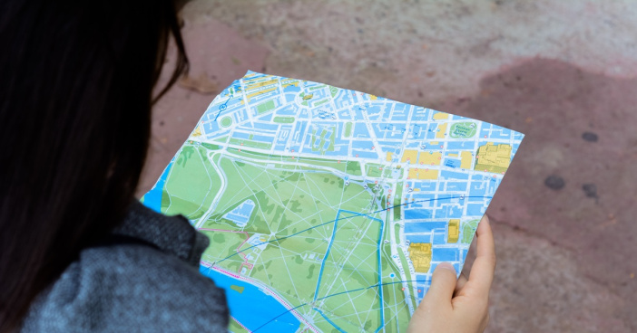

When presenting geographic information you also need graphic design skills. Graphic design skills help produce clear, meaningful maps that not only look professional but also captivate readers.
To design better maps, with a purpose, you should know your audience. Then put that purpose into a visual hierarchy with the layout design, map projection and scale. Now the fun part: what I like to call the 4 main graphic design components to designing better maps.
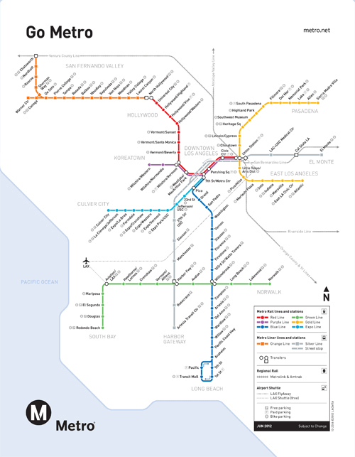
1. Color
2. Type and Type Effects
3. Labels
4. Layout
Color
Why is color important in GIS? Color defines your map and is eye catching (so be careful and don’t overuse color). Color can give your map life or it can make it an eye sore. Choose map colors that are related to the mapping topic, such as brown hues for soils features and blue hues for water features. Contrasting colors help off-set two objects touching each other or overlapping each other.
Type and type effects
Fonts are the personality of a map; they may be serious or carefree. Fonts need to be legible at small sizes and odd angles. There are several different type effects that can add value to a map. Callouts are used for when you need to identify points in a densely labeled or otherwise inaccessible location on the map. Shadows increase the legibility of text on maps. Halos are similar to shadows and can be used to improve the contrast of your text with the background. Halos break lines where they are close to text so the text remains legible.
Labels
Labels play an analytical role on a map. Clear labeling helps your audience correctly interpret the map data and should follow conventions of placement, position, style, size and alignment. The ESRI ArcMap software provides many label style options and automatic label placement options. A general rule to labeling is to position the text closer to the point or feature it labels than to any other point or feature with which it could be mistakenly associated.
Layout
Planning a layout and balancing empty space is the final component to designing better maps. Why is the layout of a map important? It defines the orientation, readability and flow of your map. The layout depends on the purpose of your map. Which elements of your map do you want people to notice first and remember when they finish reading the map? That is where the visual hierarchy of the layout comes into play. There will be some features of a map you want displayed as background information while other features will be in the foreground displayed as more important.
For more information on how to design better maps, let us know.
Did you enjoy this post? The author of this article is Karlee Mccracken. Learn more about her here.